The current logo for this portfolio came from a long line of evolutionary predecessors. Since I can’t publicly go into all of the details of some of my professional engineering work, logo creation is a fun element of pure unbridled creative design that gives me a subject to more easily discuss. So sit back and get ready for a very boring story that I found quite exciting at the time.
When setting out to create an online portfolio, you need a domain name. I find this early phase of searching and brainstorming to be some of the most fun, and frustrating. So many .com domains are registered, leaving but table scraps for the late-comers. But the scarcity drives up the need for a little creativity and resourcefulness.
I wanted a name that worked both as a portfolio name, but also as a future potential business name, if that time ever came. I wanted something professional, simple, and creative. I needed a name that brought to mind engineering, design, and art.
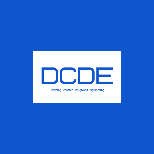
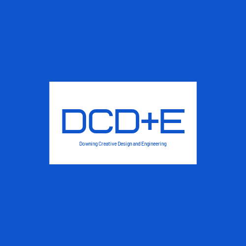
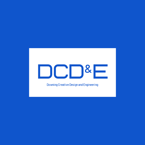
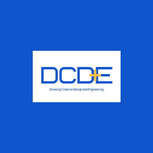
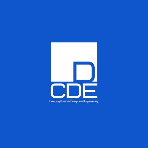
You’ve got to start somewhere. Downing Creative Design and Engineering fit most of those initial requirements. Shortened: DCDE.com. It was something I could see attaching my name to one day. The domain was for sale, and the allure of owning a 4 letter domain was tantelizing; so I played with some options.
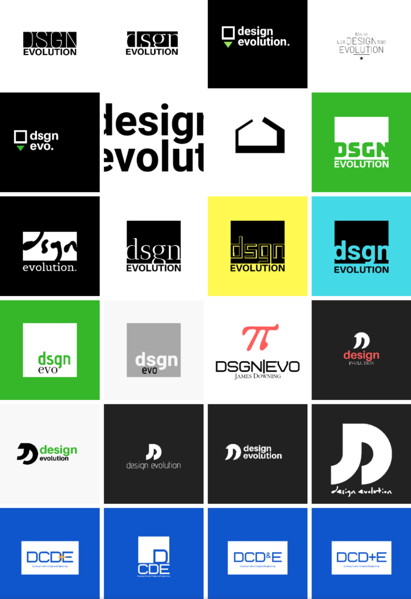
Like any new design, you need to first concept some real rough ideas to get an idea of where the customer (conveniently myself in this instance) stands. Below was the starting point of studying colors and fonts and looking for an initial direction.
Looking back-they are so raw, but they were a runway. From what I found, I started putting together some rough initial logo concepts based on what I liked in the concept study above, still working around the original DCDE concept name. As you can see, I obviously felt like I had a clear direction on color and font…
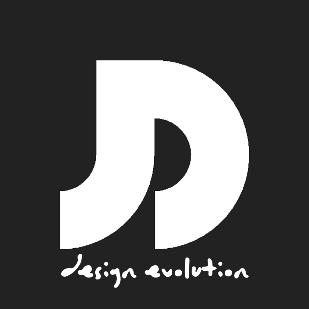
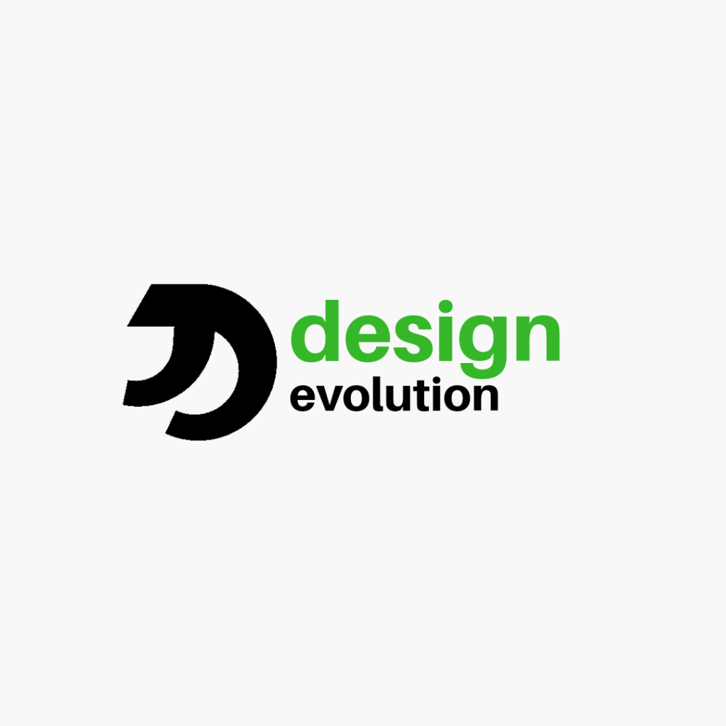
Somewhere around this time, I found out the cost of buying the DCDE 4 letter domain, which sent me back to the drawing board. It was time to branch out to other ideas. I wanted a simple name, but something unique and memorable. Something that might have a future use in some distant time where I start doing more independent work. As I searched for the right word, I found myself following thesaurus links. Design eventually led me to Evolution. All design evolves over time, that’s largely the process of creation, and a portfolio could certainly show an evolution of the body of work over time too. At first I went down the path of my initials paired with EVO. JDEVO.com had an interesting ring. I played a bit with how J and D could be paired together as a monogram logo.


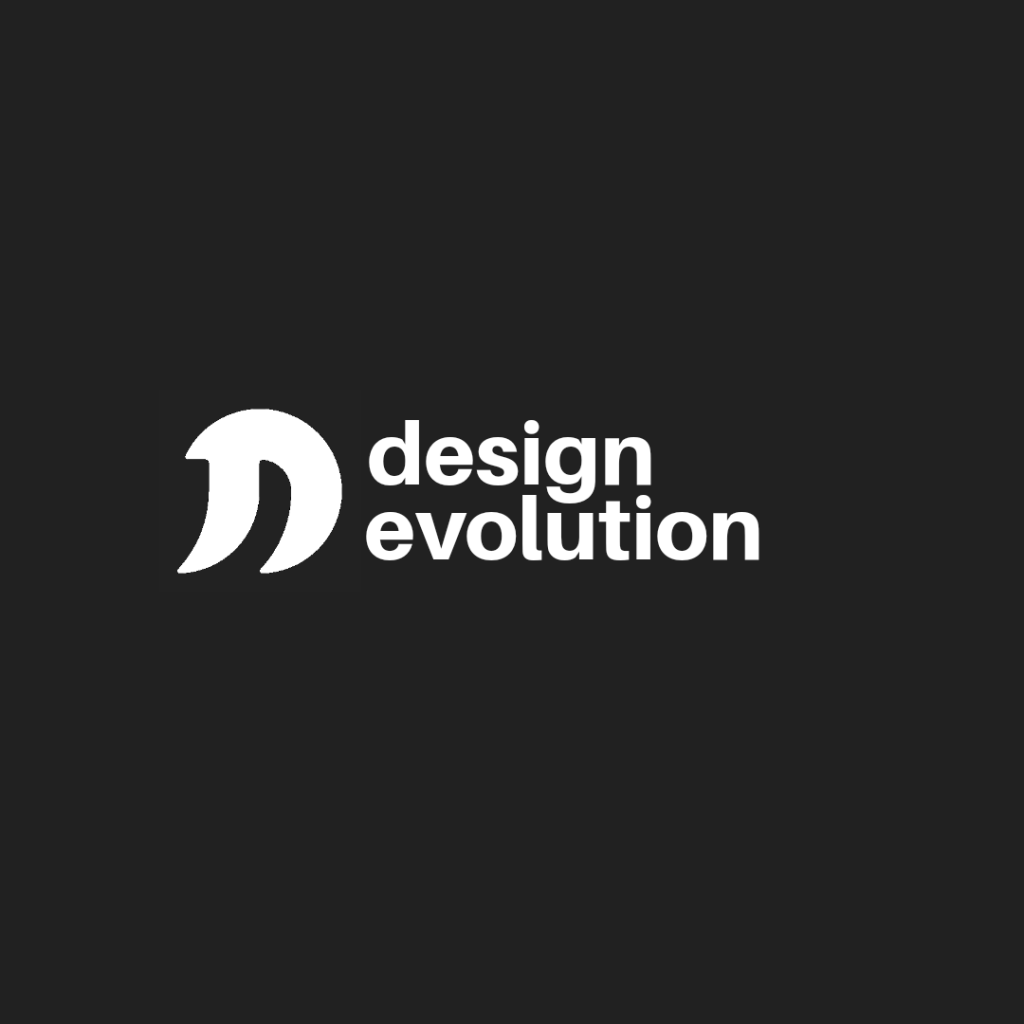
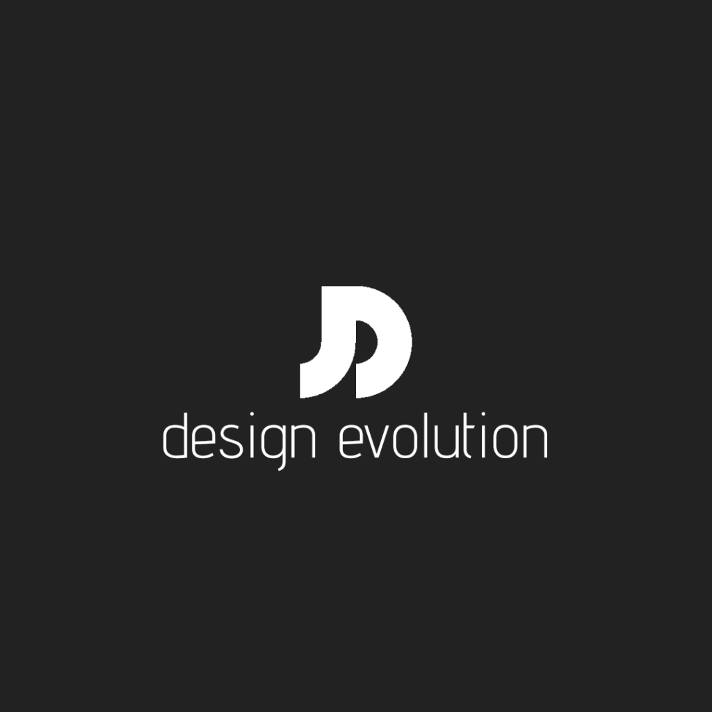
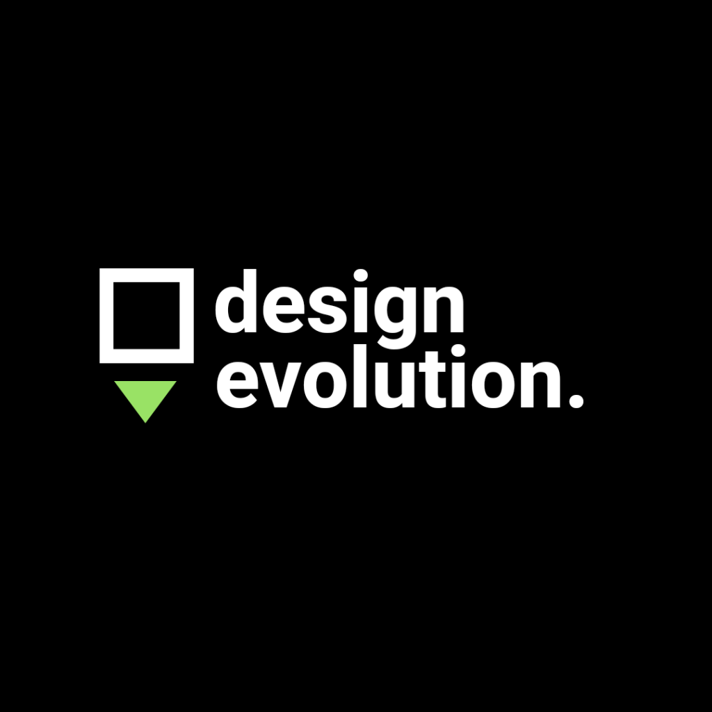
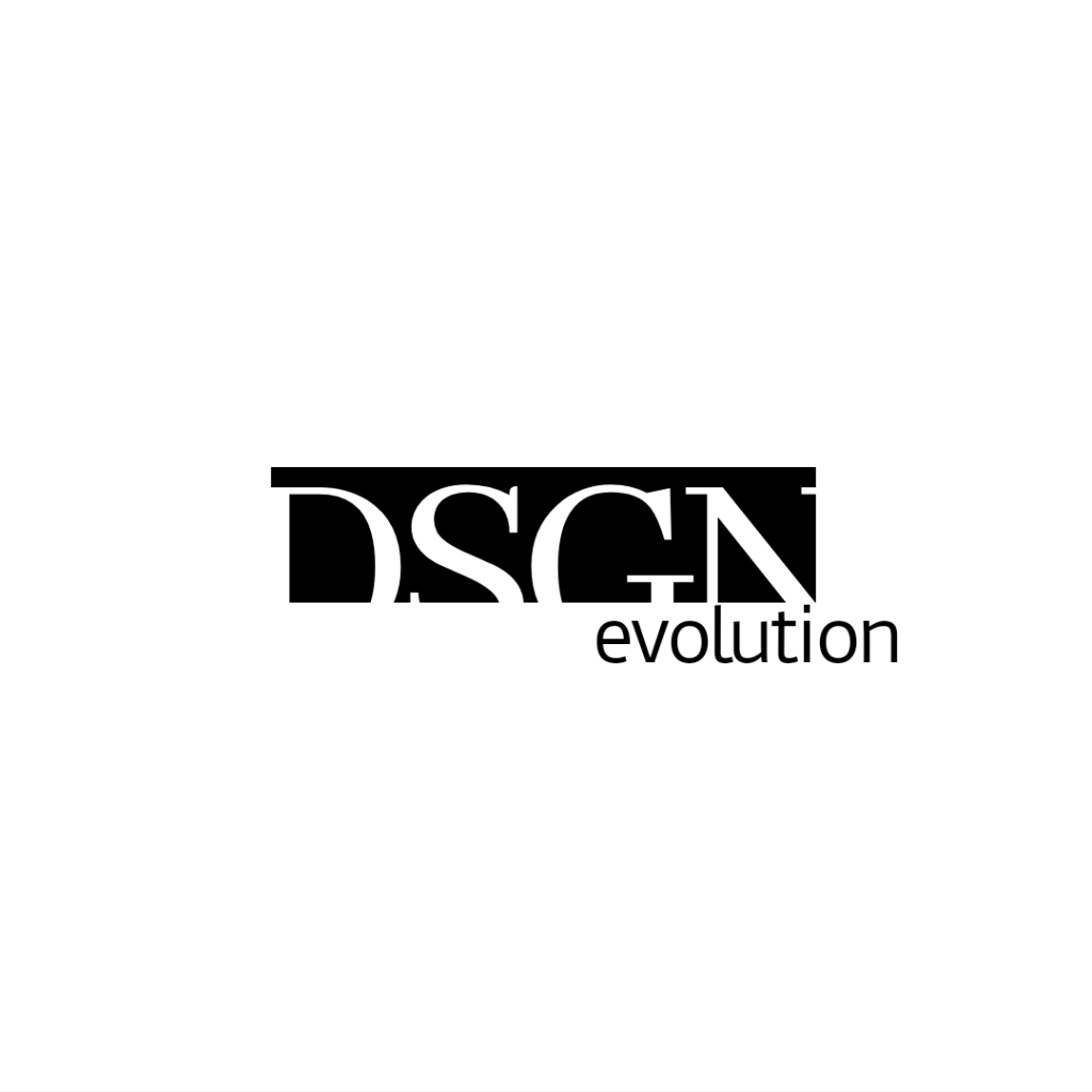
And started playing with fitting in the words “design evolution”.
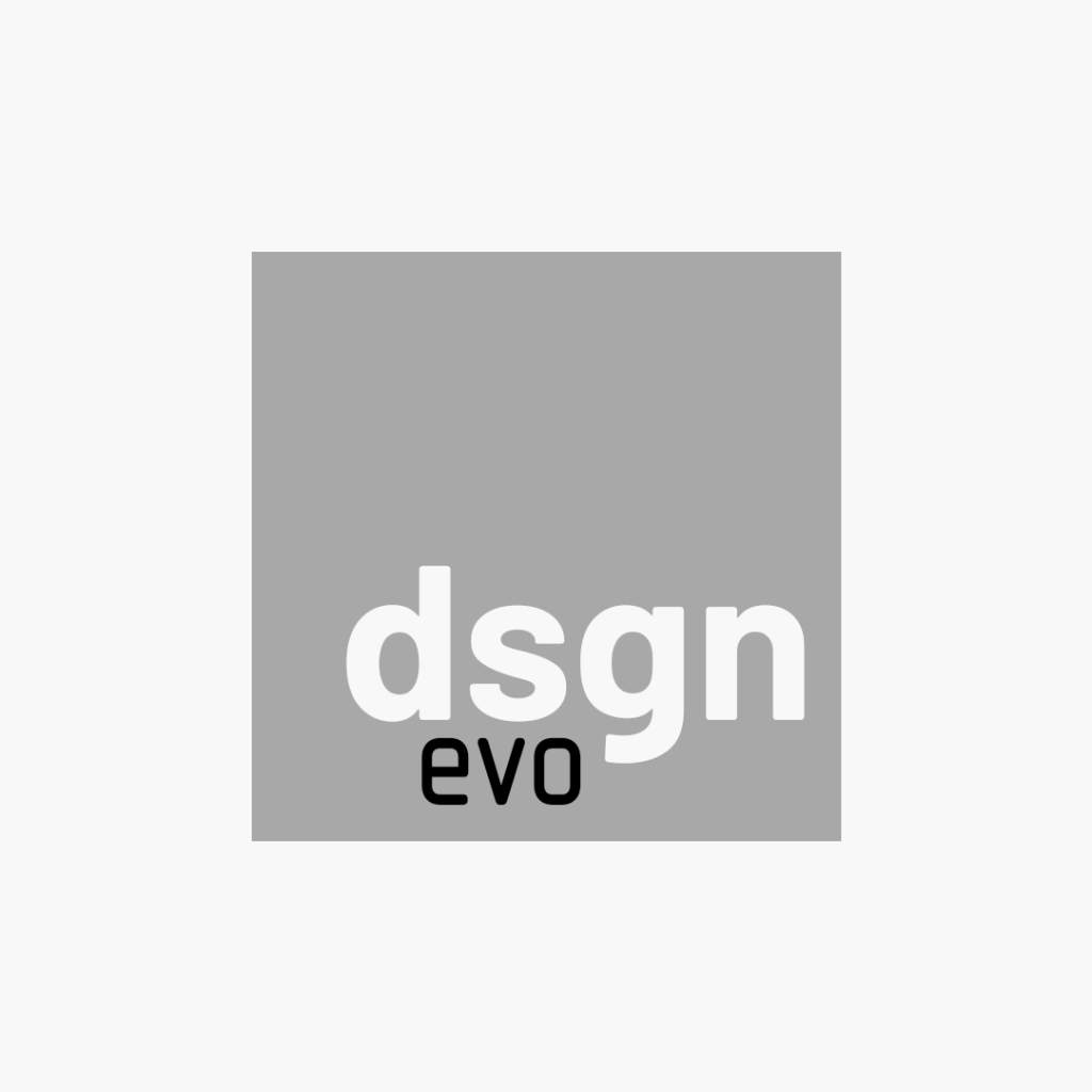
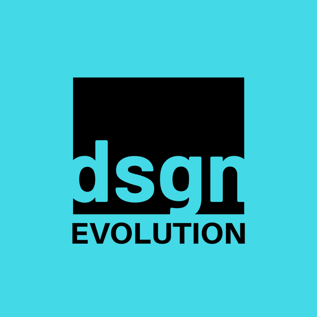
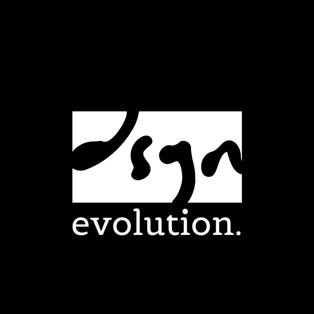
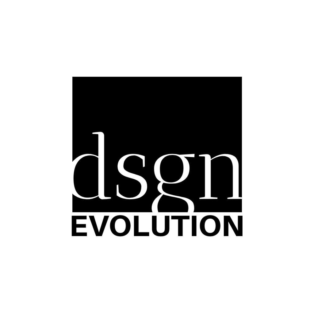
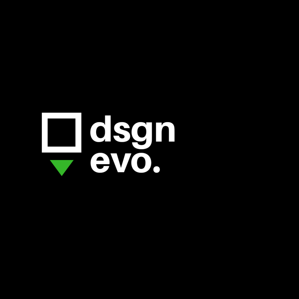
This last one was a pivot point. I started looking at this new abbreviated version of ‘design’. DSGN. And evolution. Evo. I feel like the mental jump between design and DSGN is easy and modern. It’s pretty short, memorable, simple, and it’s available as a .com. Interesting. Time to dive deeper.
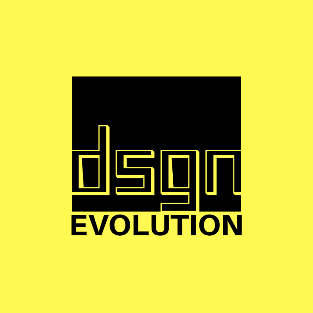
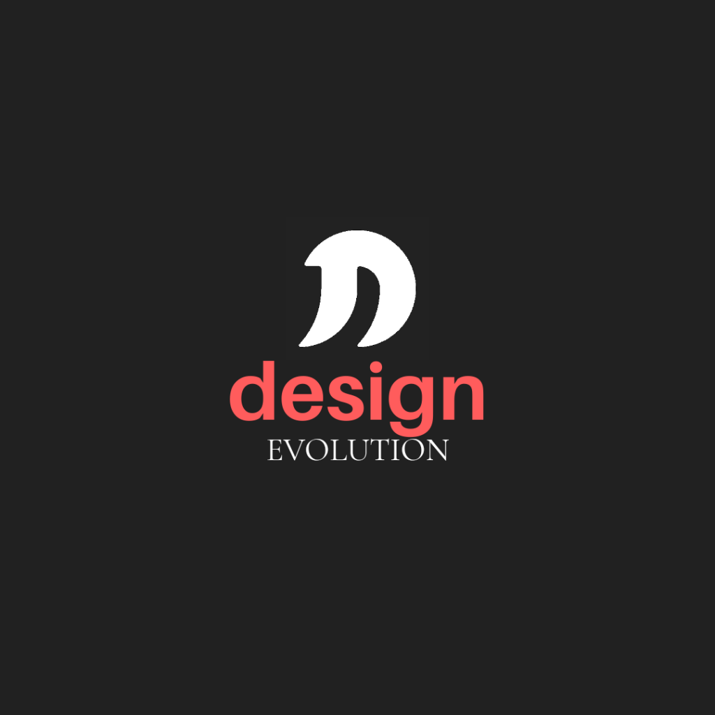
I realized I was literally stuck in a box. Time for another pivot. This time telling myself to get out of the box. The logo reflected that direction, not only because I was in a box, but also because generally I think it’s a good design mantra. You’ll see the visual imagery in some of these.
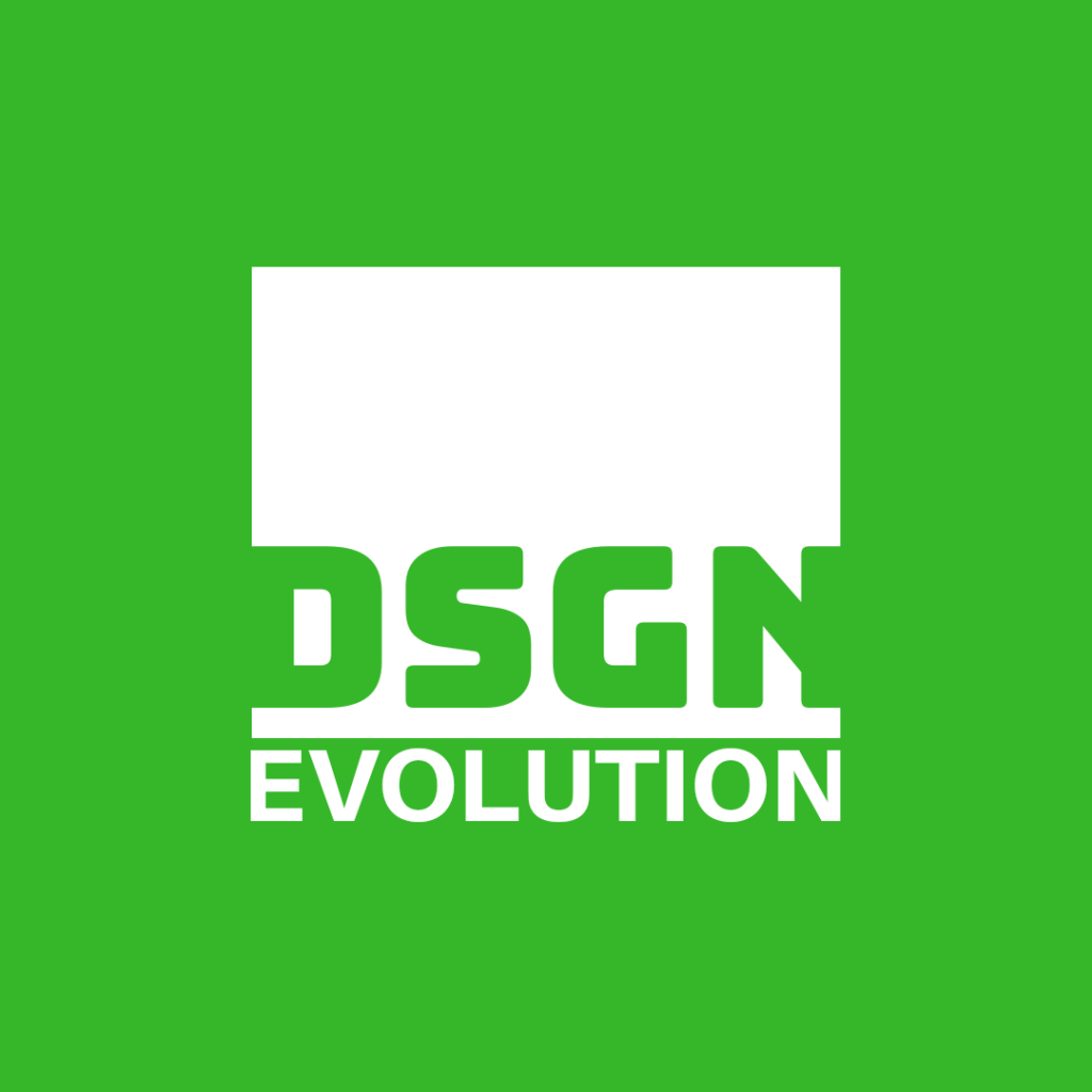
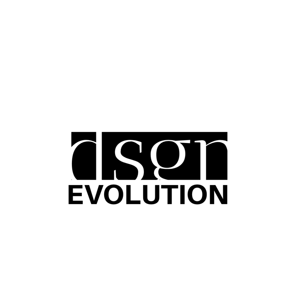
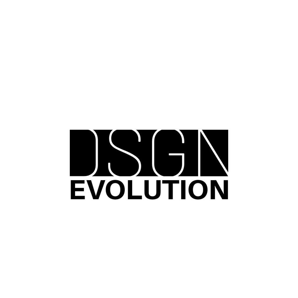
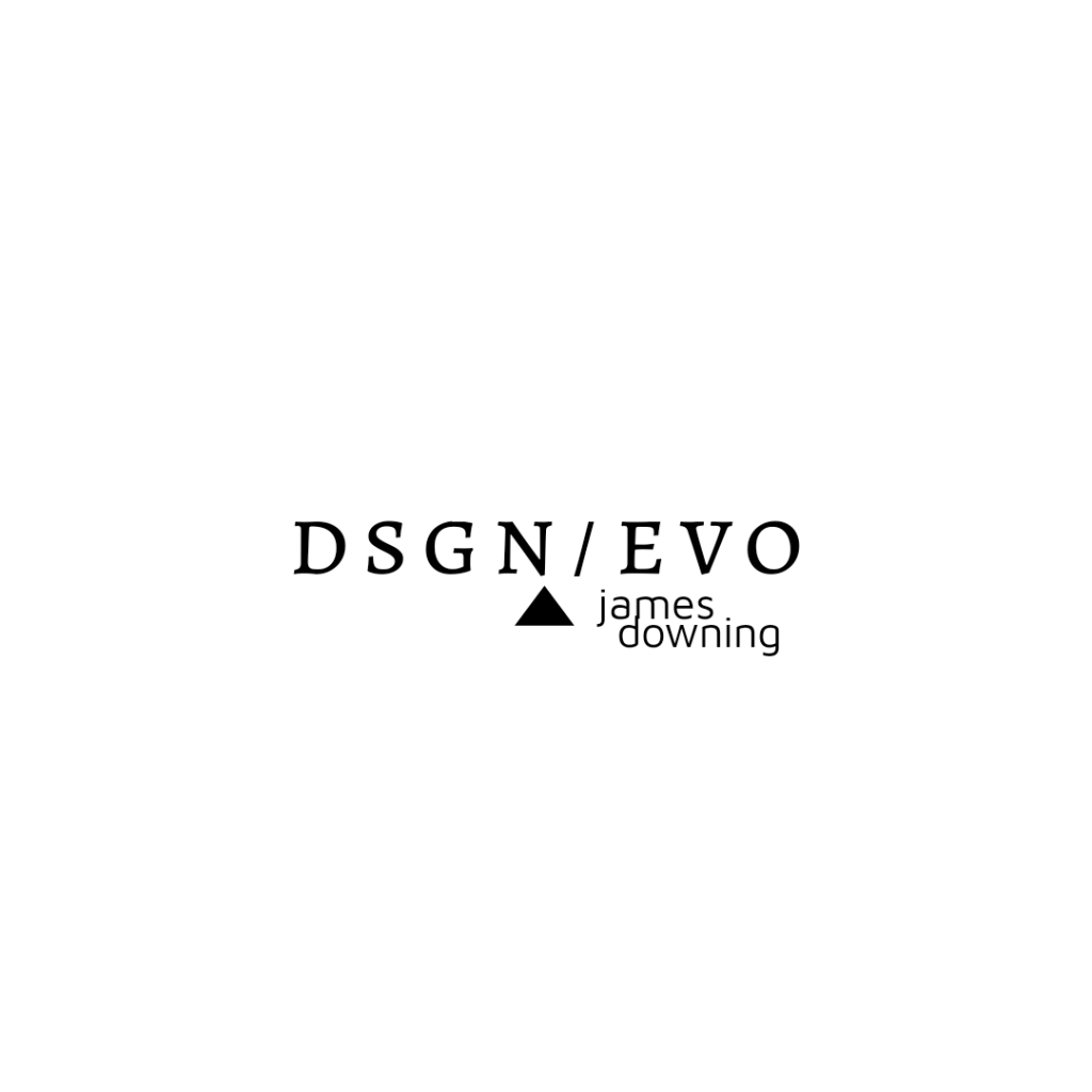
I liked where I was going, but after sleeping on it, I felt like it wasn’t nuanced enough. Although simple, it felt too contrived. I just wasn’t done. If you look at the last in-the-box design a little further above, you’ll see where I returned to and what started the next line of study. Some of which I still think are very compelling. I decided to push it to the literal edge.
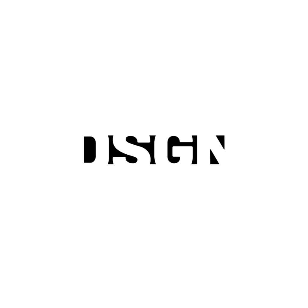
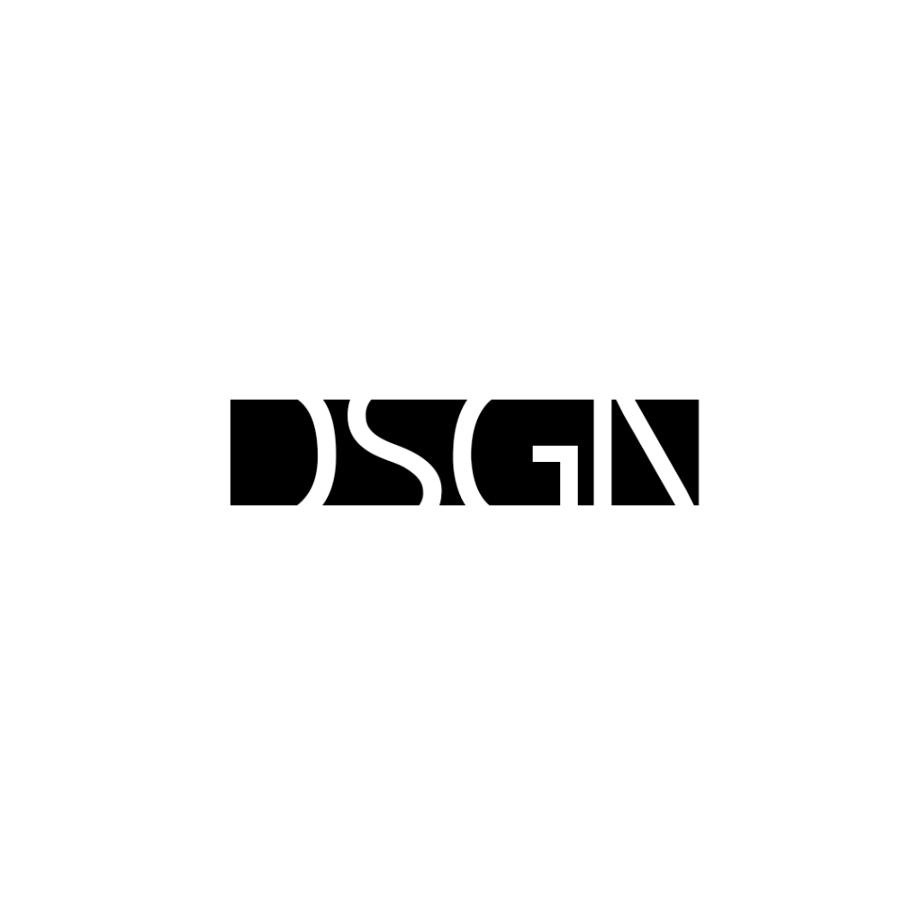
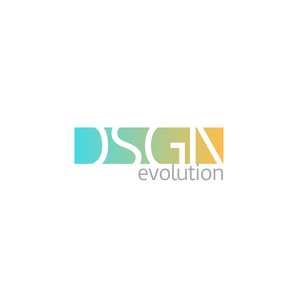
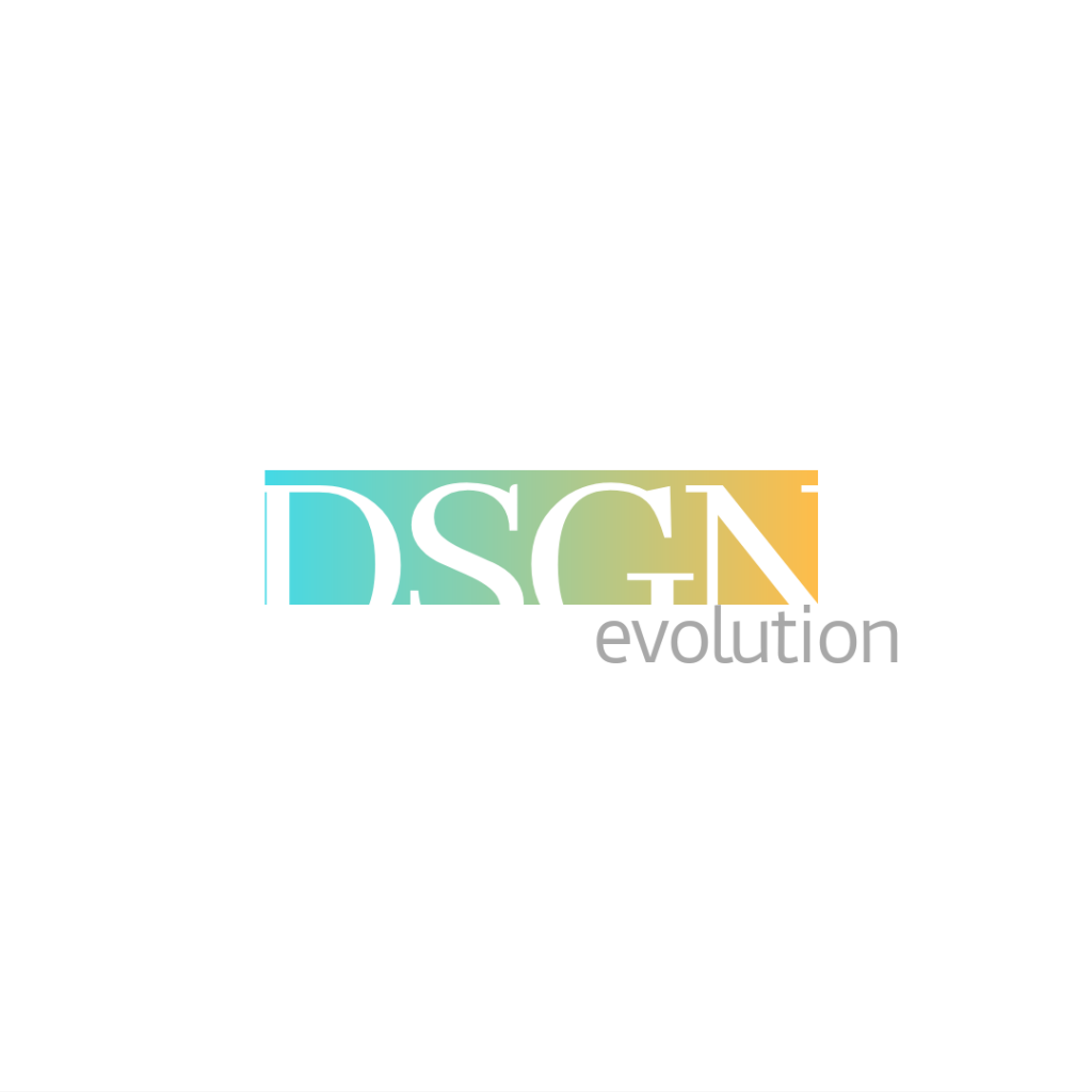
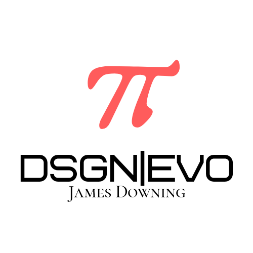
Alas, “DSGN” isn’t the portfolio name, not alone. It had too much emphasis. It reminds me too much of a TV channel name. There were some legibility issues. And I didn’t like how I had to awkwardly attach “evolution” to it. It didn’t flow like I wanted it to.
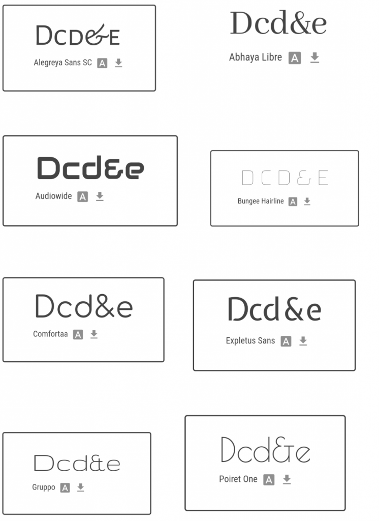
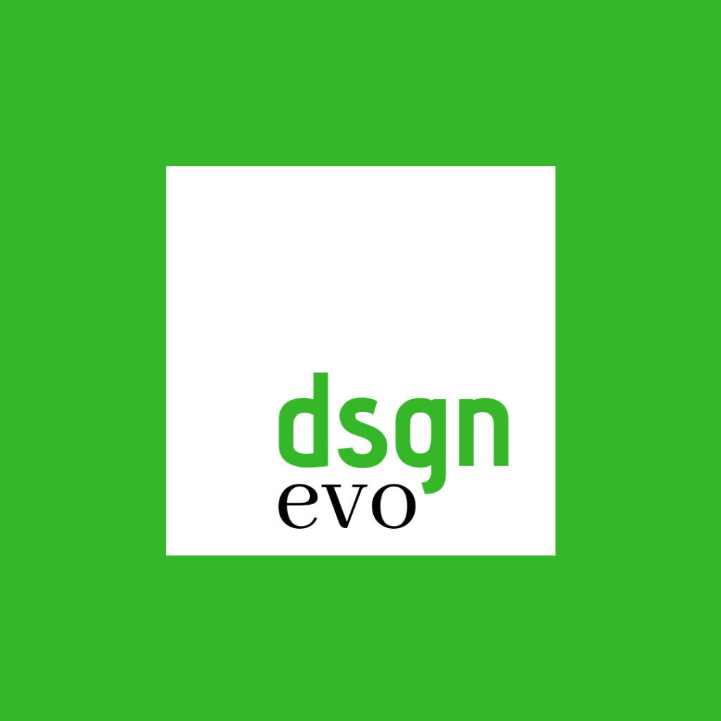
Taking out a clean sheet, I just wrote “dsgnevo”, and started over with shapes and fonts. I built off of what I had learned in the above studies. I liked the visual division from the “pi” logo, and found that a slash divided the logo into two sets of 4 characters. I was playing with the arrow point from an earlier set of logos where I was getting out of the box, and accidently found that when used upright, it resembled a seesaw fulcrum.
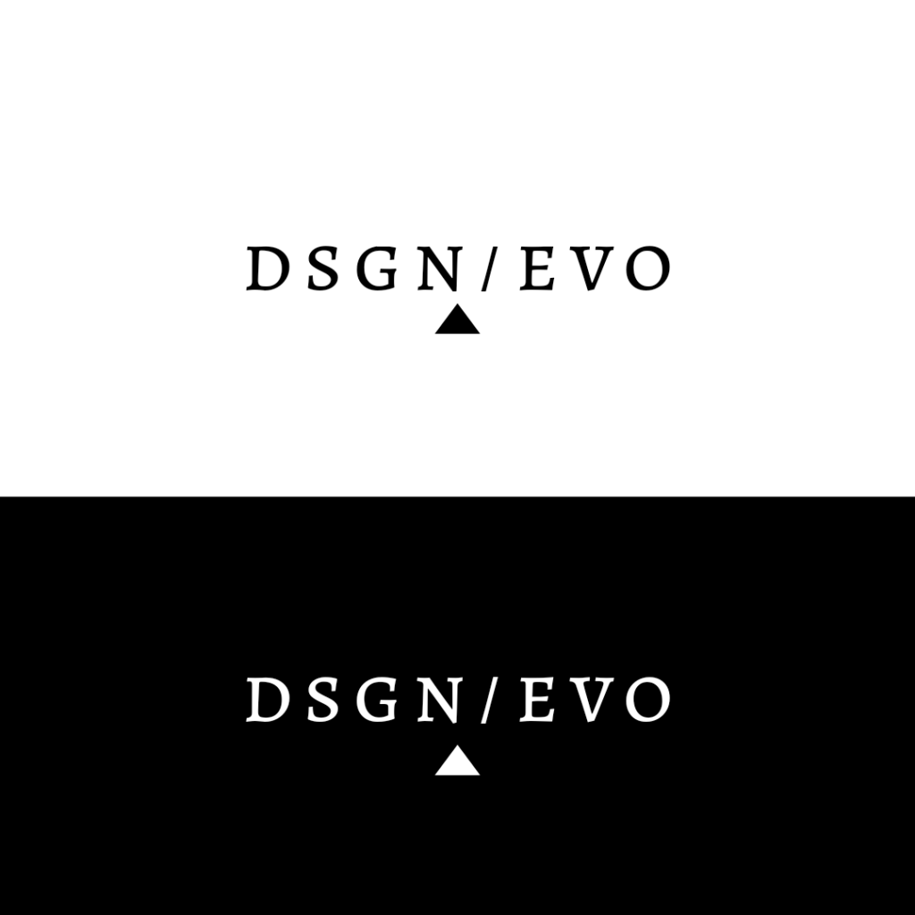
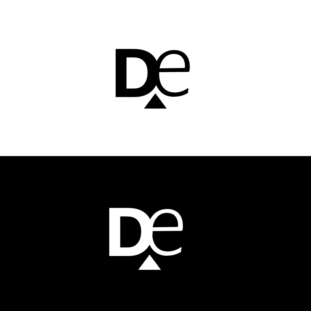
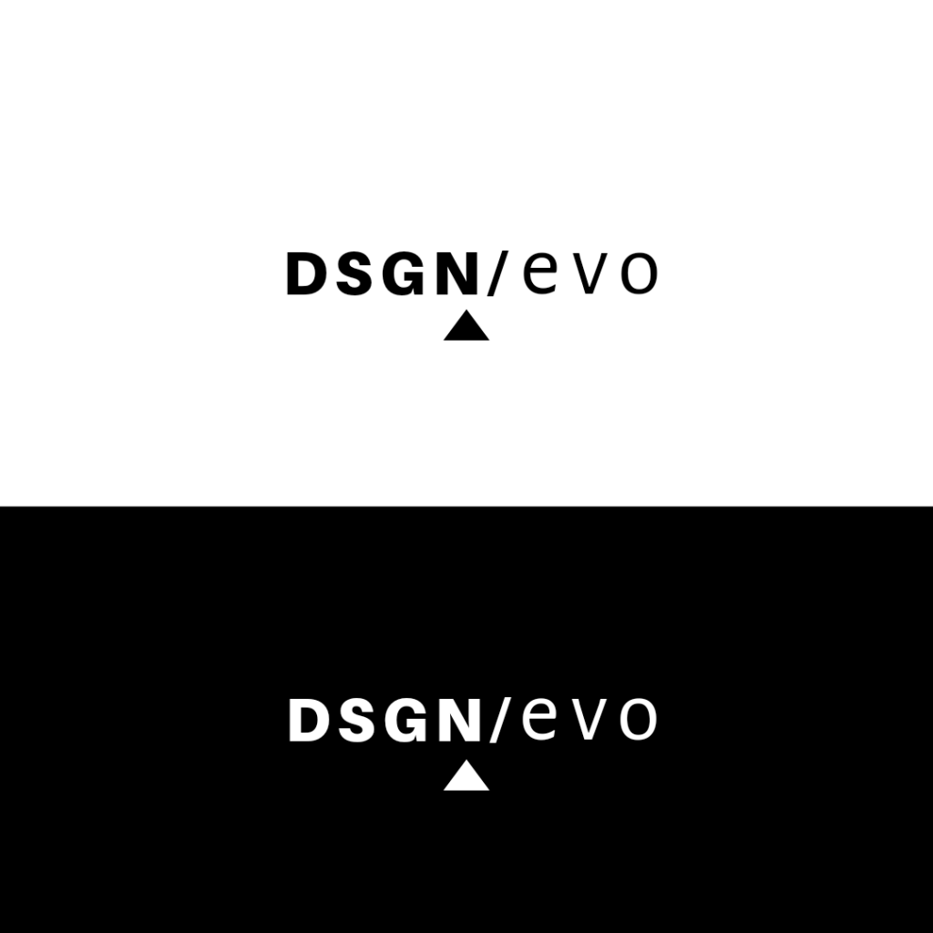
I liked that the logo explicitly represented the name of the domain. There was no disconnect. As I dove further the first and second halves of the name felt like they needed unique identities. This was solved by applying a bold sans serif font to the first half, to really punctuate it, and a thin serif font for the second half. I felt like it expressed the yin and yang of design, and that it visually depicted the “balance” that is needed in all types of designs. I also appreciated that the fulcrum design element could easily be repurposed to other future scenarios, such as the square format of the site icon in your browser tab.
Thanks for reading. -james